
Easily create a Card with flexible Grid Builder
In this article, Our Piotnet Grid will instruct how to easily create a card (design your cards) just by dragging & dropping the plentiful widgets, choosing your favorite styles, set dynamic content with third-party integrations.
“Card” is a crucial component of a grid layout; multiple cards possibly are assembled into a Grid. Card layouts are popular ways to display content, and their content areas can be easily repeated and viewed on various device types.
You can choose to import our pre-made demos or create new cards yourself in the following steps.
Detailed tutorial to create a card by Piotnet Grid Builder
Launch the Editor
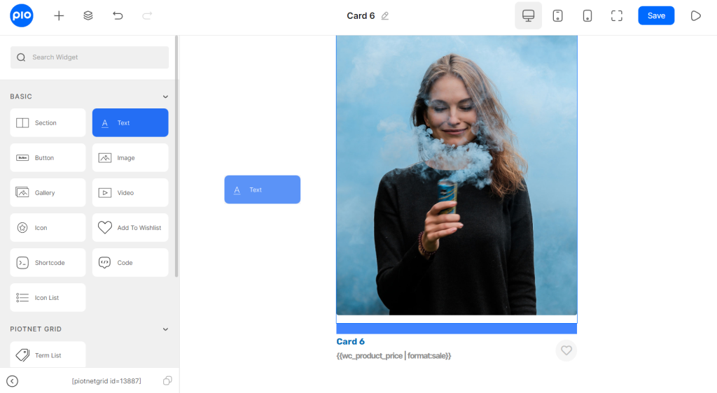
- Go to your WordPress Dashboard > Piotnet Grid > Cards > Add New > Add Card Title > Edit With Piotnet Grid
- Piotnet Grid Editor will be launched. Drag and Drop widgets from Editor Panel to design your Card.
- You should create a section first as the container, duplicate the column inside the section if you need to have more than one, and then put widgets inside the columns.
Widgets to create a Card
Basic Category
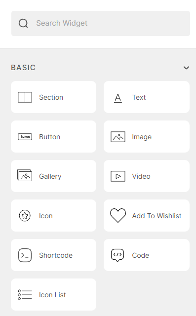
Widgets in Basic Category
- Section with Columns: two main layout types of Piotnet Grid to cover elements.
- Text: to show your content, you can use dynamic tags to query custom fields, WooCommerce data, information of users, etc.
- Button: it can redirect to another page URL.
- Image: a Widget to dynamize your Image custom fields, feature images, or uploaded image with a variety of available standard sizes.
- Gallery: Similarly, a widget to dynamize your Gallery image.
- Video: a widget to query your video from your external sources via custom fields
- Icon: Add an icon from a library.
- Add to Wishlist: you can allow your customers to keep track of the products they are interested in, so they can find them quickly and easily at a later time and buy them. <click here for more information>
- Shortcode: to embed your components.
- Code Widget: customize code by PHP/HTML/CSS/JavaScript to show your dynamic content.
- Icon List: add a list of Icons from a library.
Other Widgets
- Term List: Show your specific Terms List.
- Product Badge: Display product status: product on sale, non-sale, out-of-stock.
- Quick View (WooCommerce): a component of “Add to Wishlist” to have a quick look at the product image.
- Product Rating (WooCommerce): query the default of Rating Products.
- Add To Card (WooCommerce): Add product to Card button.
- Variation Swatches (WooCommerce): to show variation product swatches.
Note: Please enable Learndash to trigger Learndash widgets.
Dynamic Content in Card
We integrated Piotnet Grid with third parties for custom fields such as
- ACF,
- Metabox.io,
- Pods,
- Toolset,
- JetEngine
Furthermore, using dynamic tags you are able to get Posts, Users, WooCommerce information, etc.
You can choose to set a fixed content or let it be dynamic.
Dynamic Text
For example, to dynamize your content, add a Text Widget and click on Dynamic Tags Icon on the right of “Content Box”.
There are a variety of dynamic formats to query your text data.
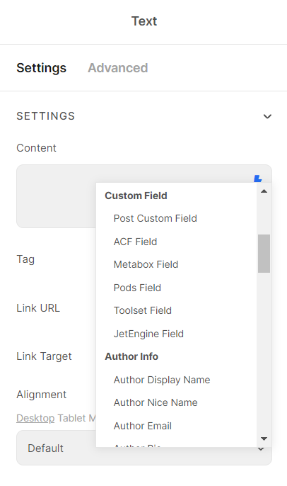
Dynamic Tags in Text Widget
Dynamic Image or dynamic Link URL
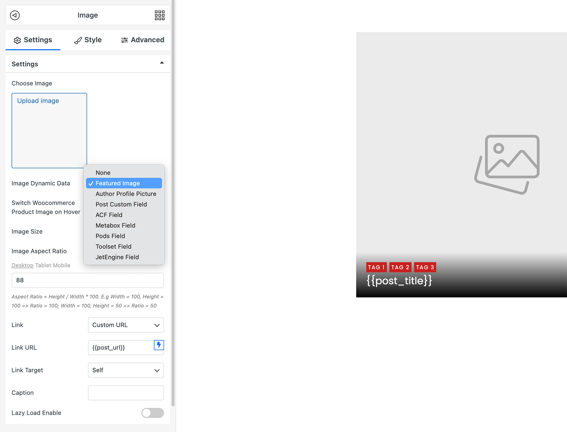
For instance: add an image widget, and choose the image dynamic data to get the sources list.
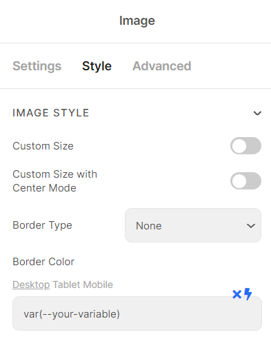
Dynamic in Style Tab
Even Background, Color, etc. could be dynamic.
Example: Switch to Style Tab (Image Widget) > Border Color > Dynamic Tags > CSS Variables format.
Dynamic Section Link URL Note
Imagine that you have 4 widgets in a covered section as the navigator below.
In case you desire to set up some Dynamic Link URLs for the single widget, the user can redirect to these URLs after clicking.
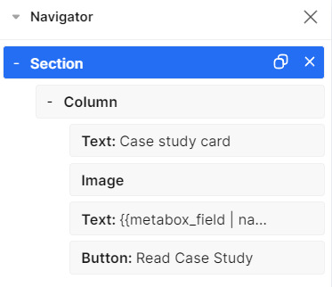
Please note, if you also set up a dynamic link URL for the covered section. It may lead to breaking out the layout of your Grid
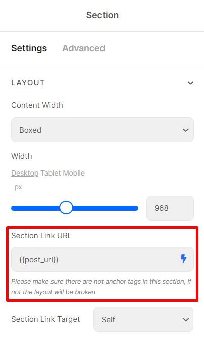
Solution: you only just need to set a dynamic link URL for the covered section.
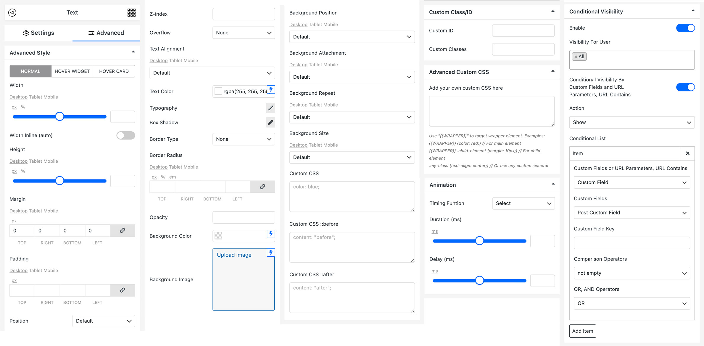
Advanced Tab (Advanced Style Tab)
Many customize style options for Widgets in various statuses: Normal, Hover Widget, and Hover Card.
In addition, you can refer to the feature: Conditional Visibility.
Other Topics:
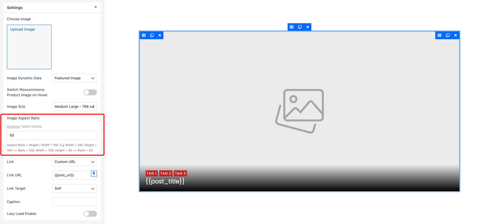
How to set the Aspect Ratio for Card
Drag and drop an Image widget > Settings Tab > Image Aspect Ratio > Aspect Ratio = Height/Width * 100.
E.g. Width = 100, Height = 100 → Ratio = 100;
Width = 100, Height = 50 → Ratio = 50.
More information on Aspect Ratio
Set Image Aspect Ratio Illustration
Overlay Content on the top of the Featured image
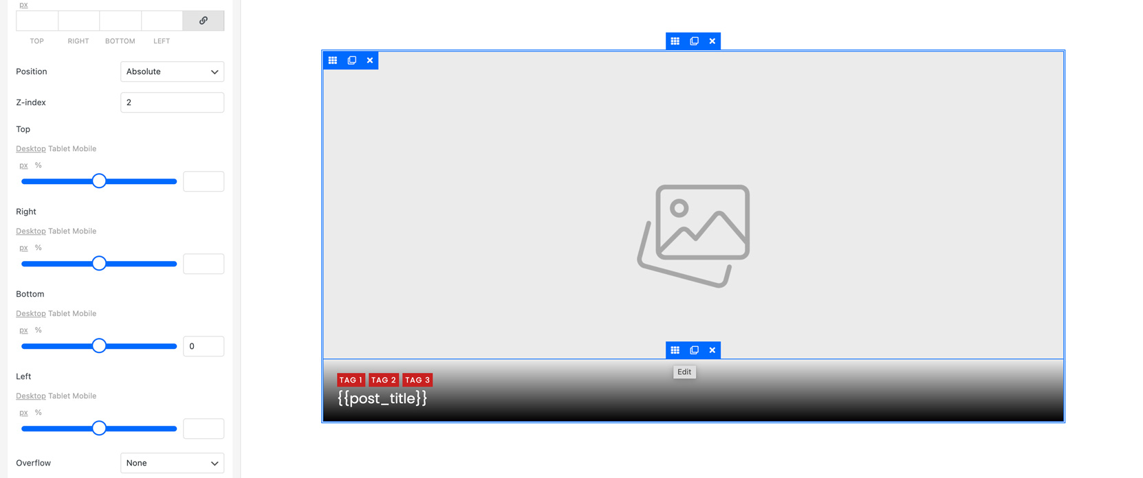
- Create a Section, temporarily call this section as father Section.
By default, there will be an inner column in the father Section. I call this column as father Column. The column fully covers the section. - Put the Image widget inside the father Column, and set the Image Dynamic Data to Feature Image.
- Drag and drop a section widget on the Feature Image, I call this section a child Section.
Also, there will be an inner column inside the child Section – I call this column a child Column.
The relation now could be described as father Section [ father Column [ child Section [ child Column] ] ]
Put contents (e.g. text widget) inside the child Column
Edit child Section > Advanced Tab > Position > Absolute;
Set Top, Right, Bottom, and Left positions for this Section:
Top = 0, Right = 0, Bottom = 0, Left = 0 for full overlay.
Left = 0, Bottom = 0 for bottom overlay.
You can set the background color or background gradient color with opacity for this Section.
Zoom in on the Featured Image when hovering
- Create a card > add an Image widget.
- Set the Image Aspect Ratio for the Feature Image.
- Edit Featured Image > Advanced Tab > Advanced Style > Hover Widget or Hover Card Tab > Custom CSS > Enter this CSS: transform: scale(1.1)
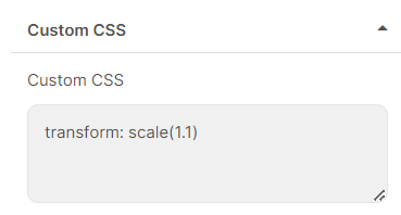
- You can change Animation in the “Animation Section” as well.
How to set Equal Height Cards
Three steps to set equal height cards (same height in columns)
- Set the Image Aspect Ratio for the Feature Image. (More information on Aspect Ratio)
- Adjust the fixed Height for the Text widgets/other widgets
- Switch Overflow mode to “Hidden” for the Text widgets and other widgets on the Advanced Style Tab
WooCommerce Product Card with Variation Swatches Widget
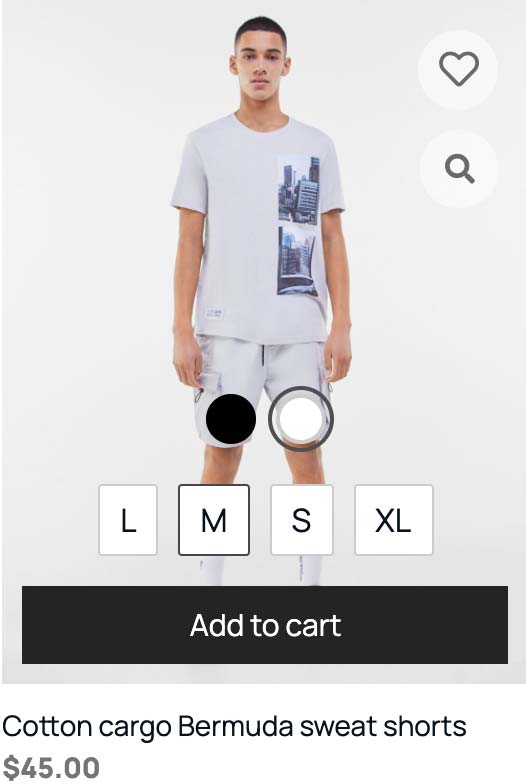
- Put Variation Swatches Widget to your Card Template
- Edit the Feature Image > Enable Get image from WooCommerce variation swatches selected
- After that, the Price and Image will be changed by the variation selected
- Edit WooCommerce Product Attribute > Select PiotnetGrid Attribute Type: Select/Color/Button/Image
- Configure terms and set the PiotnetGrid Term Color and Image
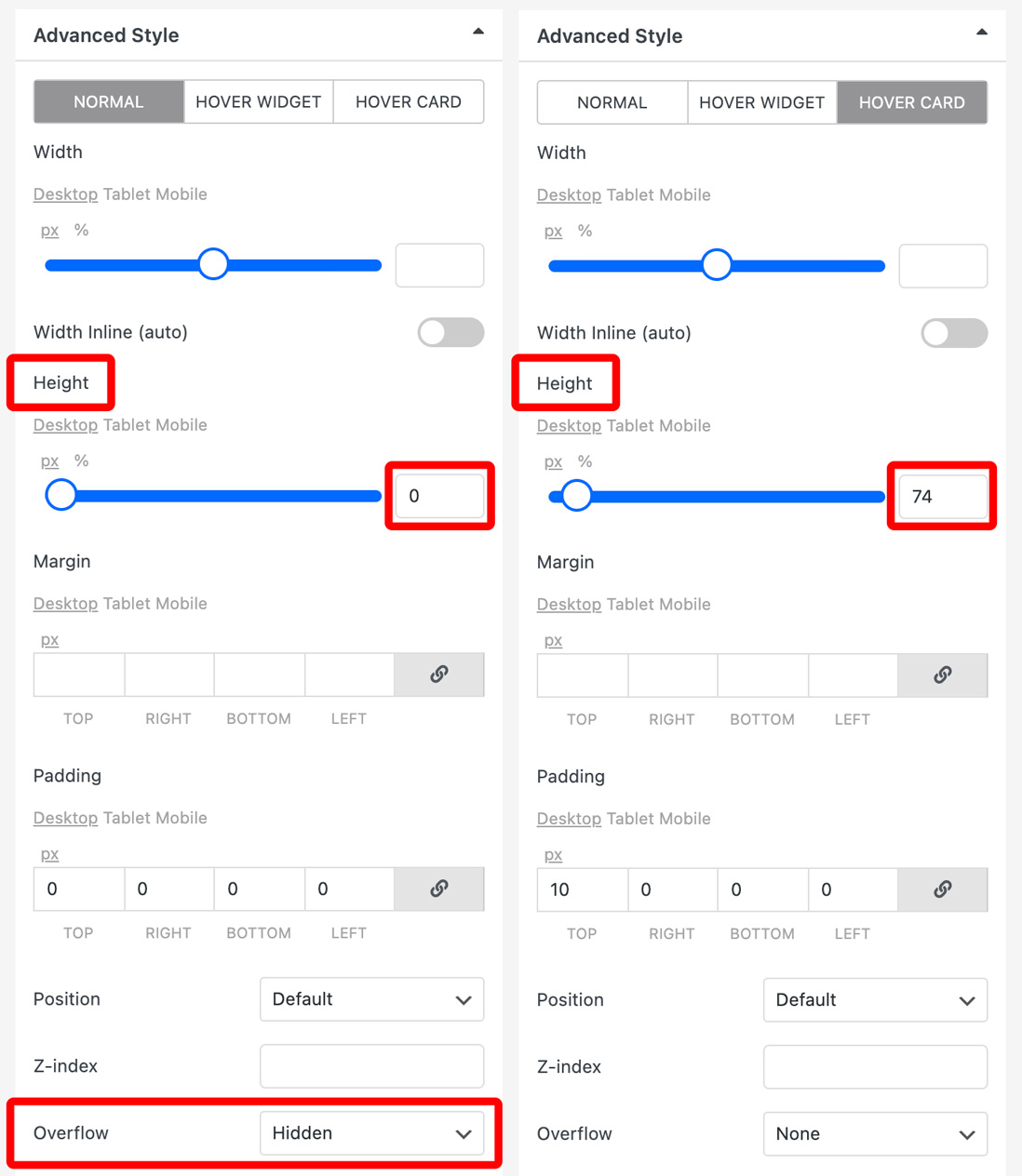
How to show a widget when hovering
- Edit the widget > Advanced Tab > Advanced Style > Normal Tab > Height = 0px ; Overflow = Hidden
- Switch to Hover Card Tab > Set the Height for Widget when hovering
Put this card into a grid and hover to see this effect.
Custom Card
In Piotnet Grid version 2.0, you can customize your Card by HTML or PHP
In Dashboard > Piotnet Grid > Click on Grids category > Settings Tab > Custom Card
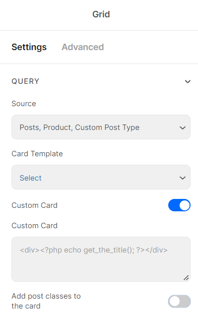
Custom Card Illustration